July 15, 2025, with the spirit of sustainable digital transformation, the Directorate General of Digital Infrastructure (DJID) officially launched the new DJID logo.
Officially, the new DJID logo as a change in visual identity was informed from the official social media of the Directorate General of Digital Infrastructure.
Not just a rebranding, the new DJID logo reflects the new direction of the directorate as the backbone of digital infrastructure development in Indonesia.
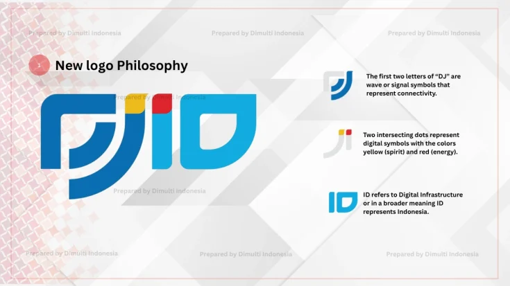
The Philosophy of New DJID Logo

The new DJID logo is composed of three main elements that reflect the philosophy of each element. The following is an explanation of the philosophy:
- The letters “DJ” – Contains a wave/signal symbol, symbolizing digital connectivity and networking.
- Red and Yellow Dots – The intersecting dots symbolize digital and vibrancy (yellow) and energy (red).
- The letters “ID” – Refers to “Digital Infrastructure” as well as Indonesia’s global identity.
The DJID’s Big Vision Identity

The new DJID logo is not just a new identity but reflects a big vision. The agency was previously named Directorate General of Post and Information Resources and Devices (SDPPI).
The change of SDPPI to the DJID was officially announced on February 7, 2025. Since its first introduction, this identity has not had an official logo.
The existence of the DJID logo further provides a great identity in realizing its vision in building a strong and equitable digital infrastructure, encouraging national technological sovereignty, and realizing digital transformation towards Digital Indonesia 2045.
We certainly need to welcome the identity of the new DJID logo in order to realize the spirit of sustainable digital transformation and strong and equitable digital connectivity.
Dimulti Indonesia is certainly excited to be part of DJID’s certification partners in supporting its vision for the country.

